
Top 10 Ionic UI Components Every Developer Should Know (With Code Examples)
If you’re building a mobile app using Ionic, knowing the right UI components can save time, enhance user experience, and help you build professional-grade applications faster. Whether you’re a beginner or a pro, here are the top 10 Ionic components you should know in 2025 — complete with examples and practical tips.
1. IonButton
IonButton is one of the most commonly used components. It’s perfect for actions, forms, and navigation.
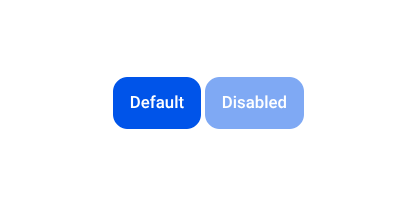
<ion-button expand="block" color="primary">Click Me</ion-button>
Key Features:
- Supports colors, icons, and shape variants.
- Works with forms and router links.
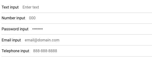
2. IonInput
For user input like text, email, passwords, and more.
<ion-item>
  <ion-label position="floating">Email</ion-label>
  <ion-input type="email"></ion-input>
</ion-item>
Best Use:
Login forms, search bars, and registration pages.
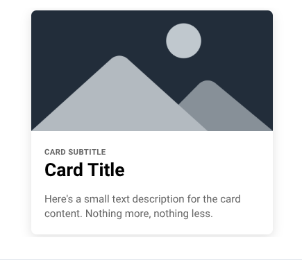
3. IonCard
A beautifully styled container to showcase content, such as products, articles, or profiles
<ion-card>
  <ion-card-header>
    <ion-card-title>My Card</ion-card-title>
  </ion-card-header>
  <ion-card-content>
    This is some card content.
  </ion-card-content>
</ion-card>
Why Use It?
For displaying data in a clean, modular way.
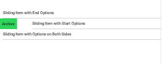
4. IonList & IonItem
Used to create scrollable lists — like contacts, chat apps, menus, etc.
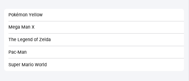
<ion-list>
  <ion-item>Inbox</ion-item>
  <ion-item>Sent</ion-item>
</ion-list>
Combo:
Use ion-avatar, ion-icon, or ion-thumbnail inside for advanced UI.
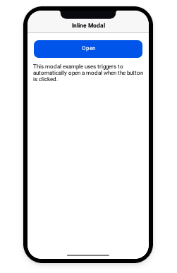
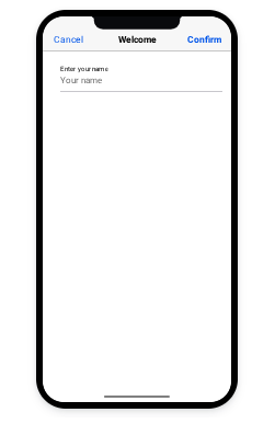
5. IonModal
A pop-up or dialog overlay to show detailed information or perform actions.
const modal = await modalController.create({
  component: MyComponent,
});
await modal.present();
Real-World Example:
Edit profile screen, product details, or filters in e-commerce.
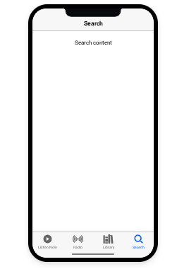
6. IonTabs
Used for bottom navigation like in WhatsApp or Instagram.
<ion-tabs>
  <ion-tab-bar slot="bottom">
    <ion-tab-button tab="home">
      <ion-icon name="home"></ion-icon>
      <ion-label>Home</ion-label>
    </ion-tab-button>
  </ion-tab-bar>
</ion-tabs>
Why Important?
It improves navigation and UX in multi-screen apps.
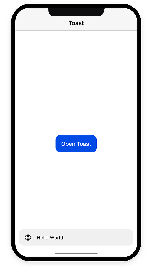
7. IonToast
Show quick, non-blocking notifications to users.
const toast = await toastController.create({
  message: 'Saved successfully!',
  duration: 2000,
  color: 'success',
});
await toast.present();
Use Case:
Show confirmation messages, errors, or alerts after actions.
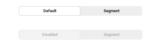
8. IonSegment
Great for category filters or tabbed content within the same view.
<ion-segment value="all">
  <ion-segment-button value="all">All</ion-segment-button>
  <ion-segment-button value="favorites">Favorites</ion-segment-button>
</ion-segment>
Popular In:
E-commerce filtering, news category switching, etc.
9. IonSlides
Used to display carousels, tutorials, onboarding screens, or image sliders.
<ion-slides>
  <ion-slide>
    <h1>Slide 1</h1>
  </ion-slide>
  <ion-slide>
    <h1>Slide 2</h1>
  </ion-slide>
</ion-slides>
Why Use:
Engage users visually with swiping gestures.
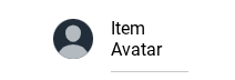
10. IonAvatar
Perfect for displaying circular profile pictures or icons inside list items.
<ion-item>
  <ion-avatar slot="start">
    <img src="/assets/avatar.jpg" />
  </ion-avatar>
  <ion-label>John Doe</ion-label>
</ion-item>
Pair With:IonItem, IonList, and IonLabel for full profile views.
✅ Final Thoughts
These Ionic UI components are the backbone of most hybrid mobile apps. Mastering them will speed up your development process and help you create beautiful, functional apps.
💡 Pro Tip:
If you want to reduce development time, check out our pre-built Ionic UI templates here — perfect for launching apps faster.